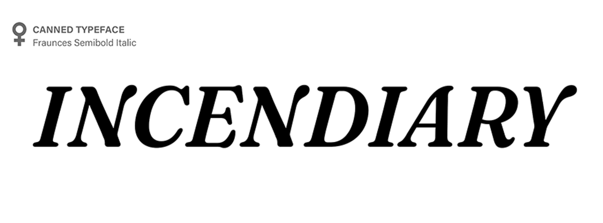
INCENDIARY
Wordmark & Publication Design | Fall 2022
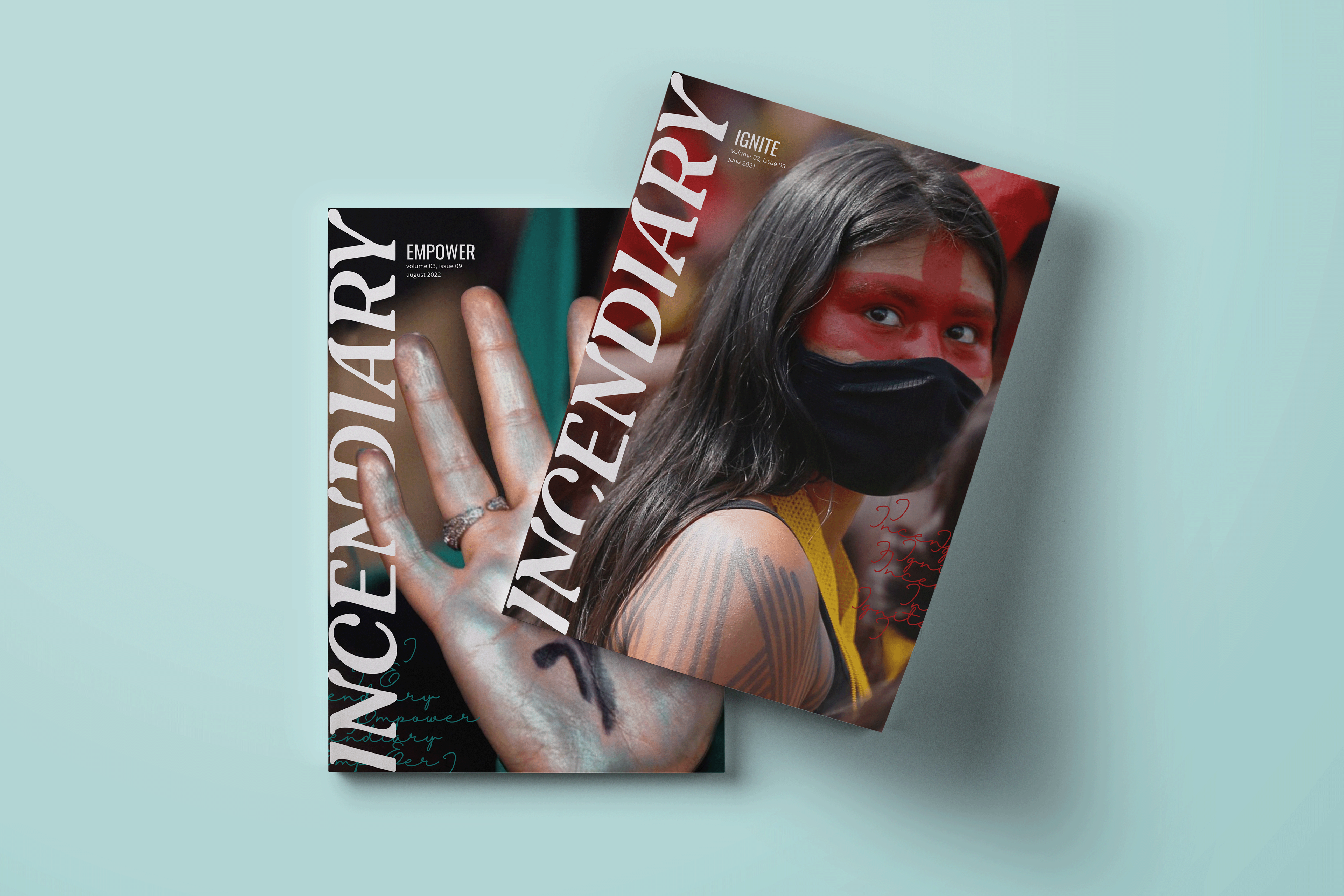
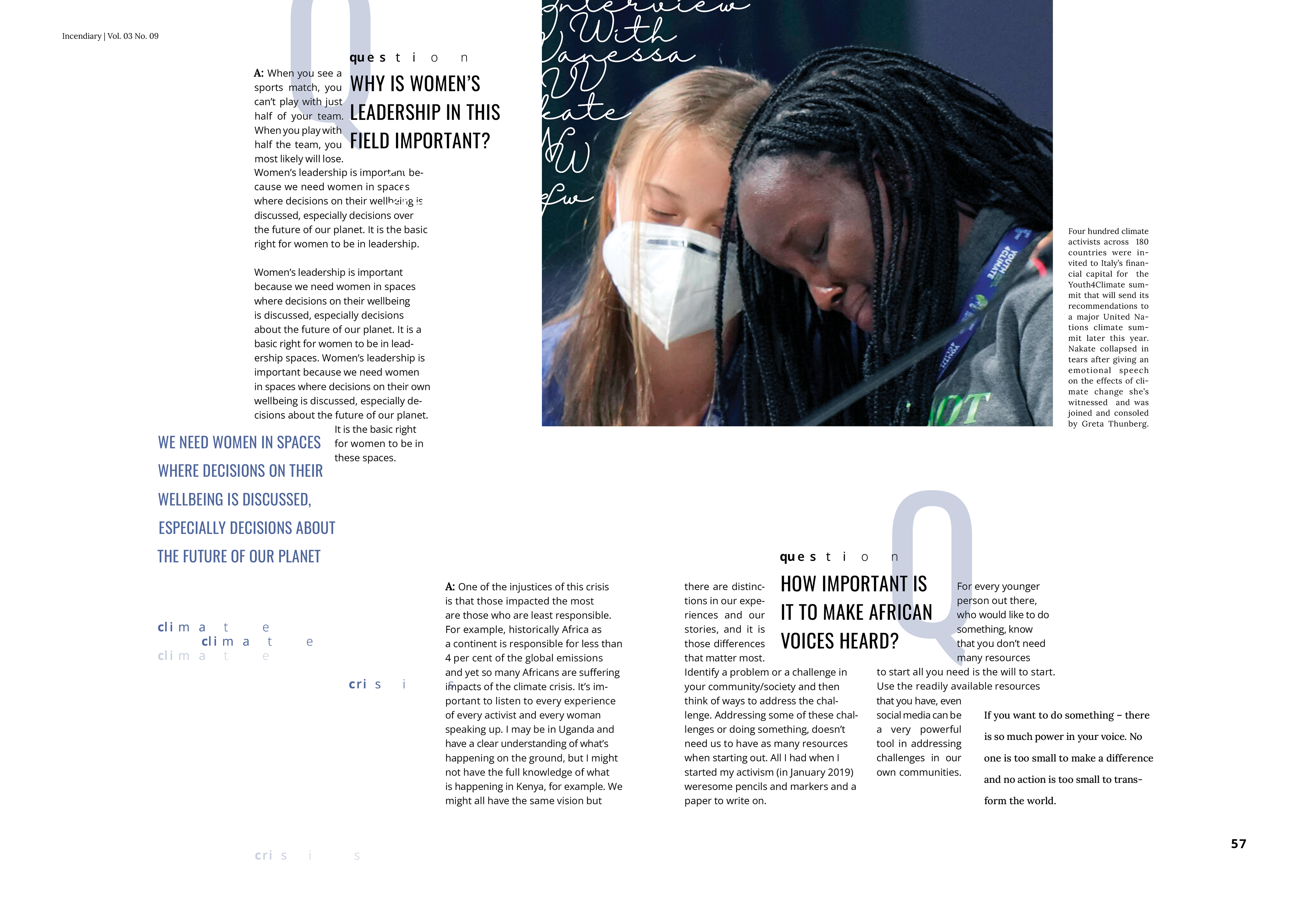
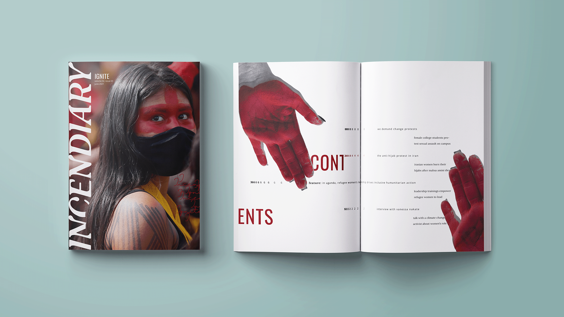
INCENDIARY is a fictional female-led social justice publication that celebrates the work of female activists all over the world. The publication gets its name in honor of the tenacious change makers who dare to ignite a fire in the pursuit of justice. The goal of this project was to create a wordmark that typographically communicates the meaning behind the publication and to utilize typographic principles to create a visual identity system across a series of publication spreads.
Early Wordmark Sketching & Ideation
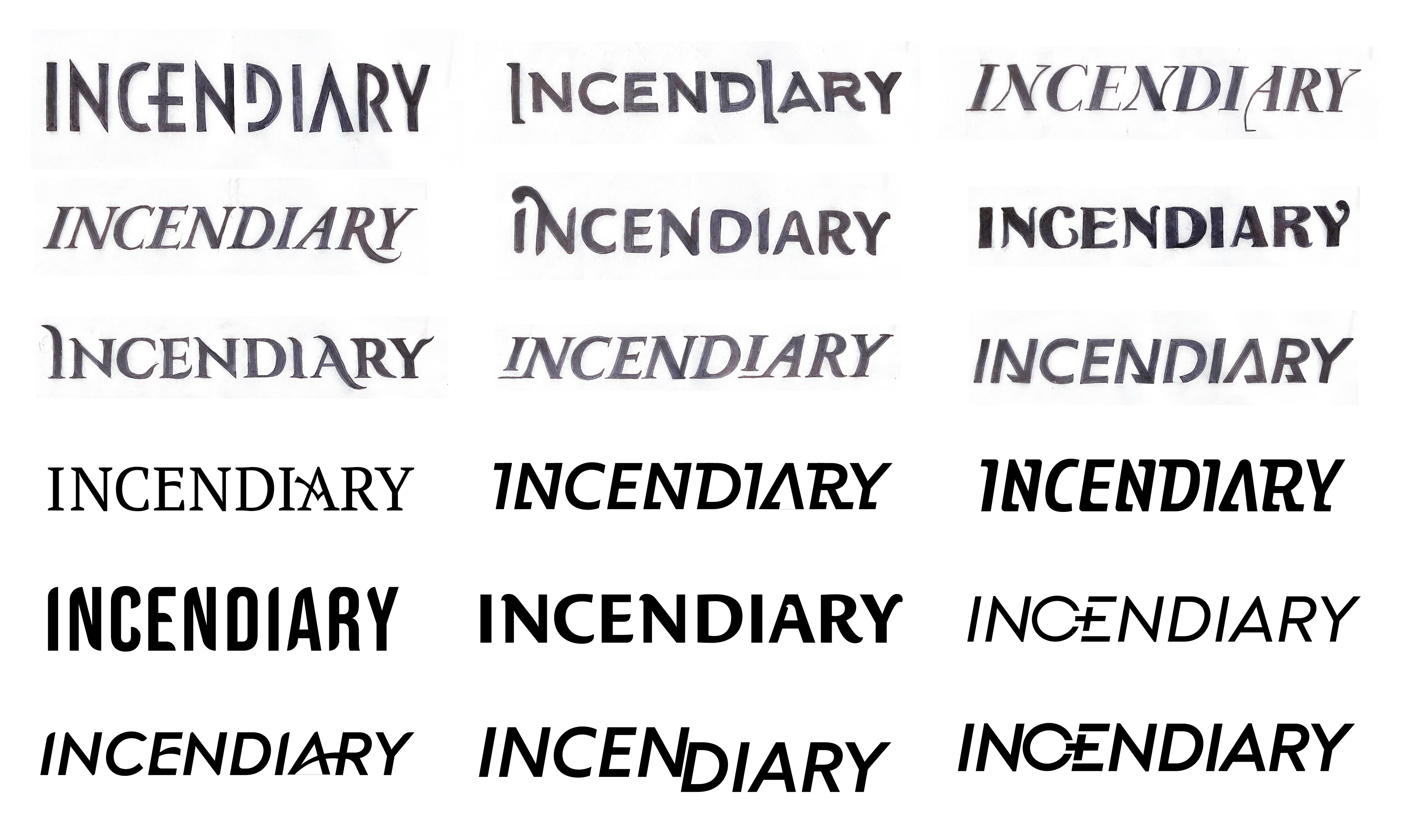
Canned Typeface Selection
I experimented with the modification of a wide variety of canned typefaces, but none of them felt right for the publication. I make a breakthrough in my process when working off of Fraunces, a typeface canned by a woman that possessed the feminine qualities and forward motion I was looking for.
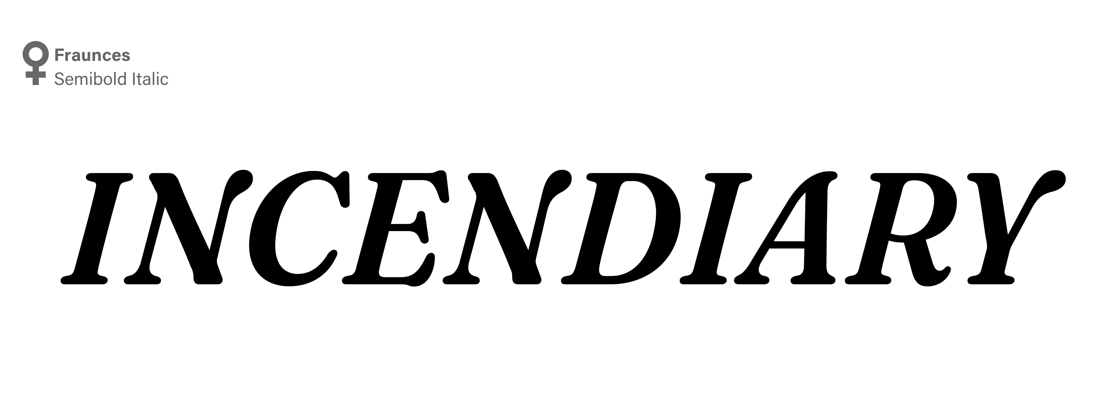
Final Wordmark

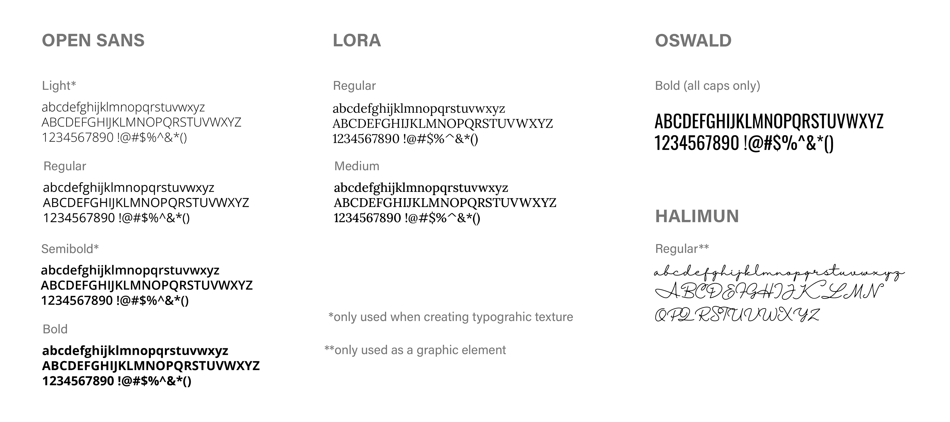
Typeface Selection
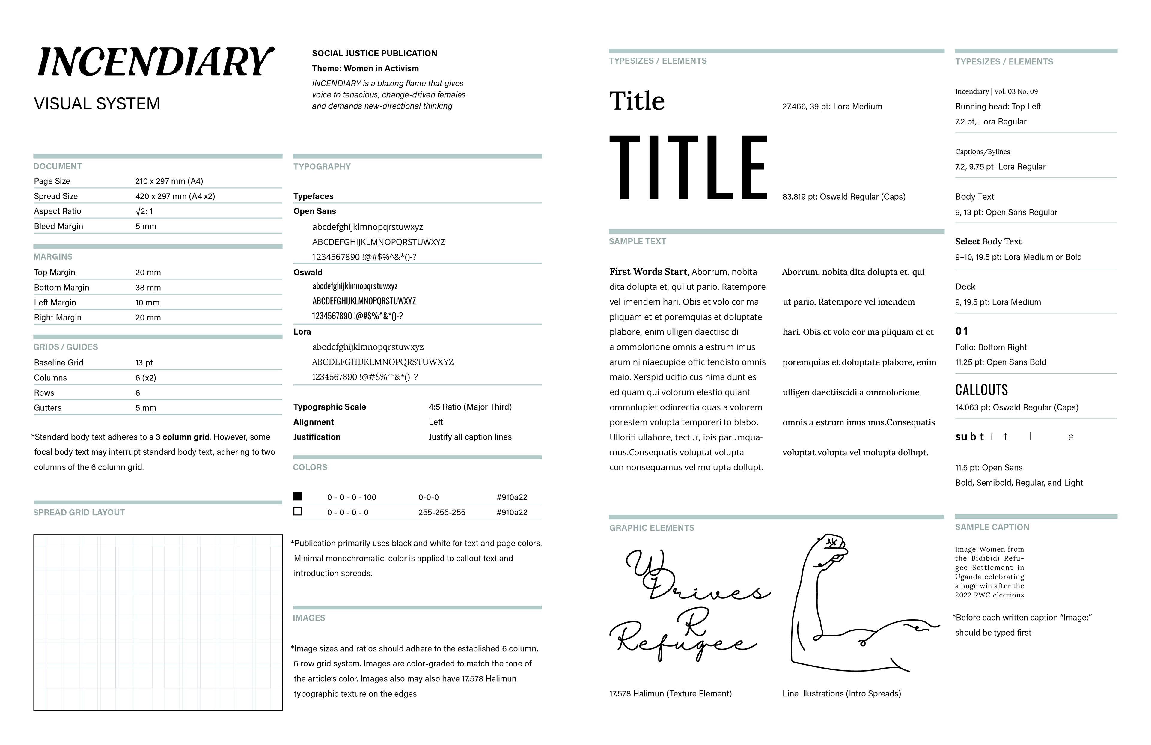
The Grid
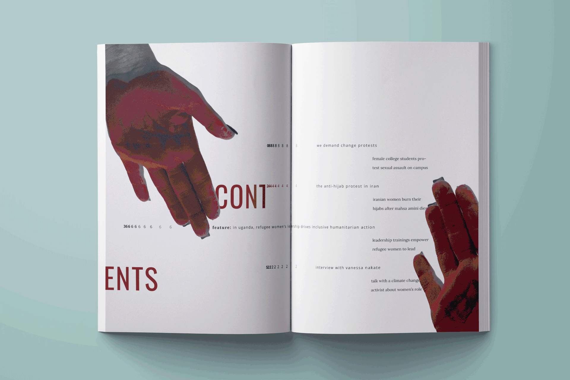
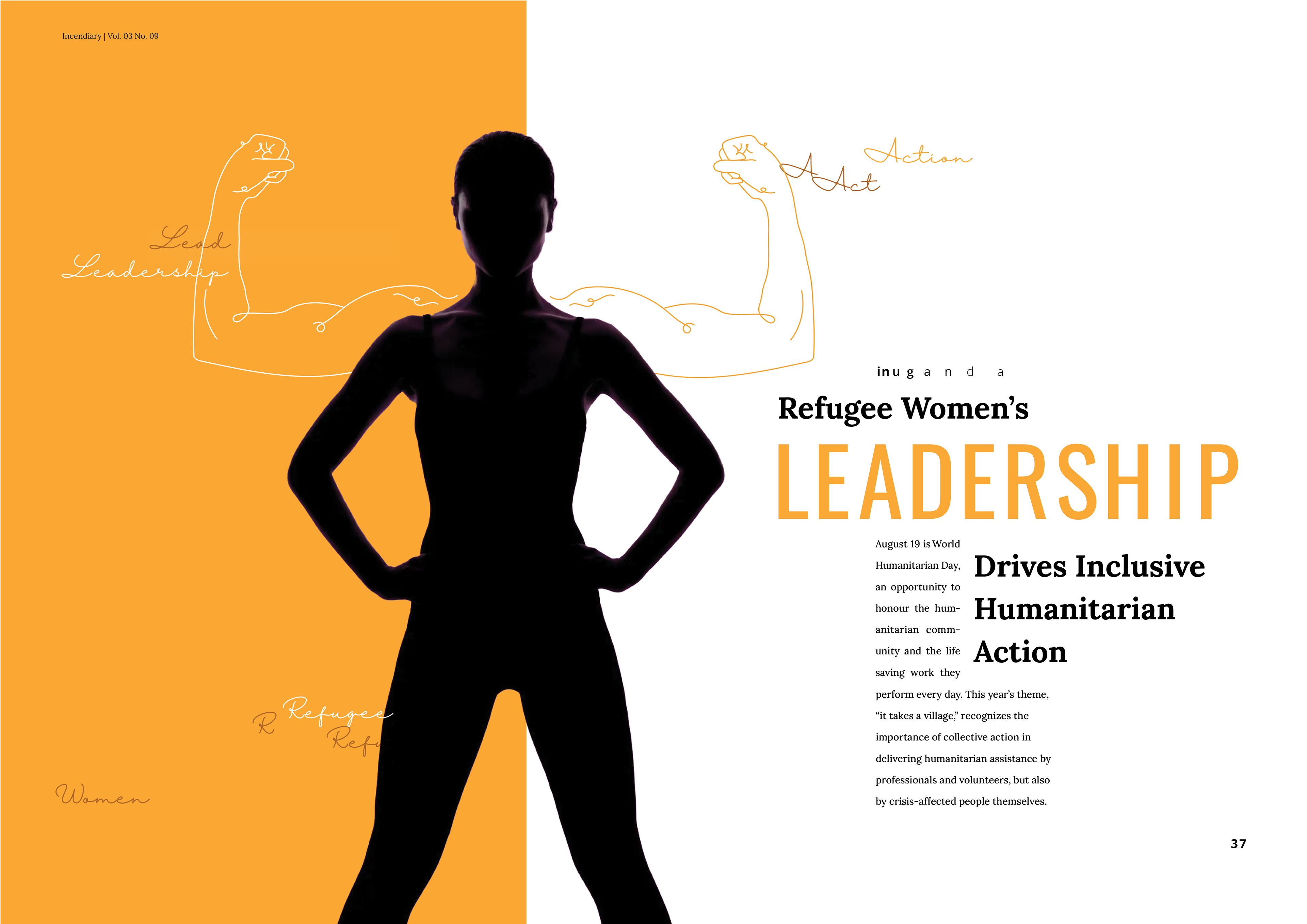
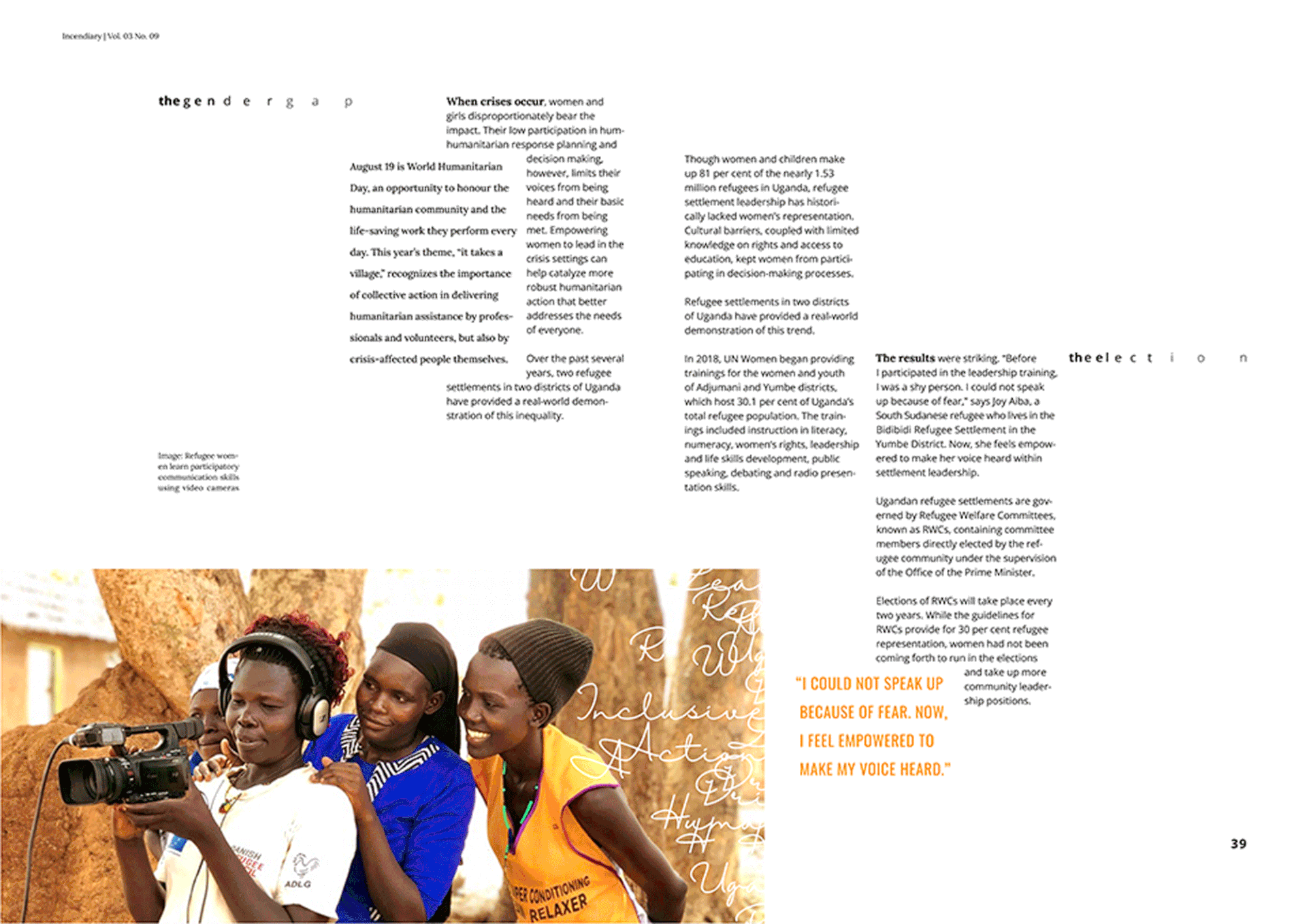
I defined a grid system to build my spreads from where body copy adheres to a 3-column grid, while captions, images, and text disruptions adhere to a 6-column grid.
Publication Visual Identity Guidelines
Final Spreads